Some recent project highlights
A quick round up of three chunky bits of work from this year
As we all need a little distraction and fresh inspiration, we’re sharing with you three new case studies we’ve been particularly invested in this year. If any of the intros below leaves you wanting for more, you’ll be able to find more in depth versions with their fair shares of pictures and process details on in our portfolio.
1, 2, 3 here we go: We’ve got a sexy brand campaign, a playful brand extension and freshly brewed coffee packaging.
First up
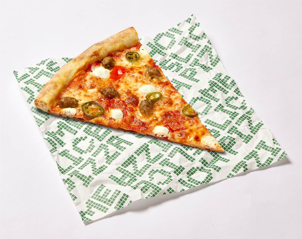
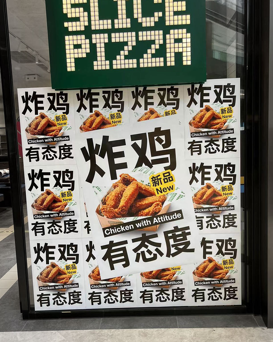
CHICKEN WITH ATTITUDE
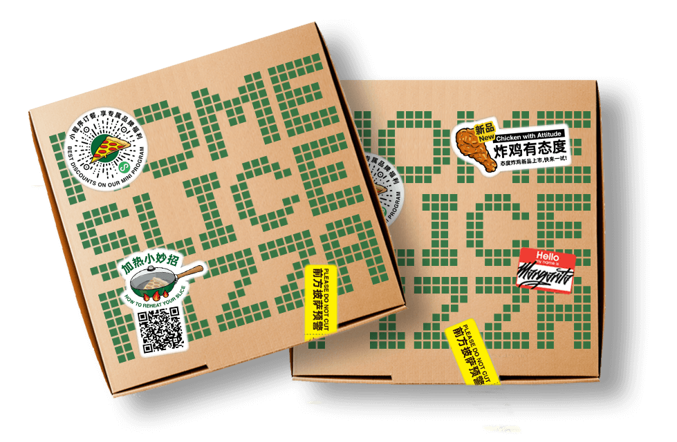
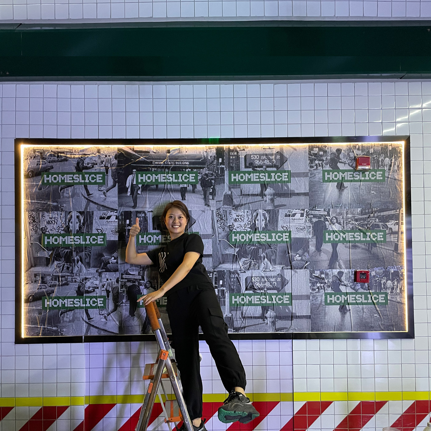
our team has been so excited to tuck into a Shanghai fan favourite, HOMESLICE!
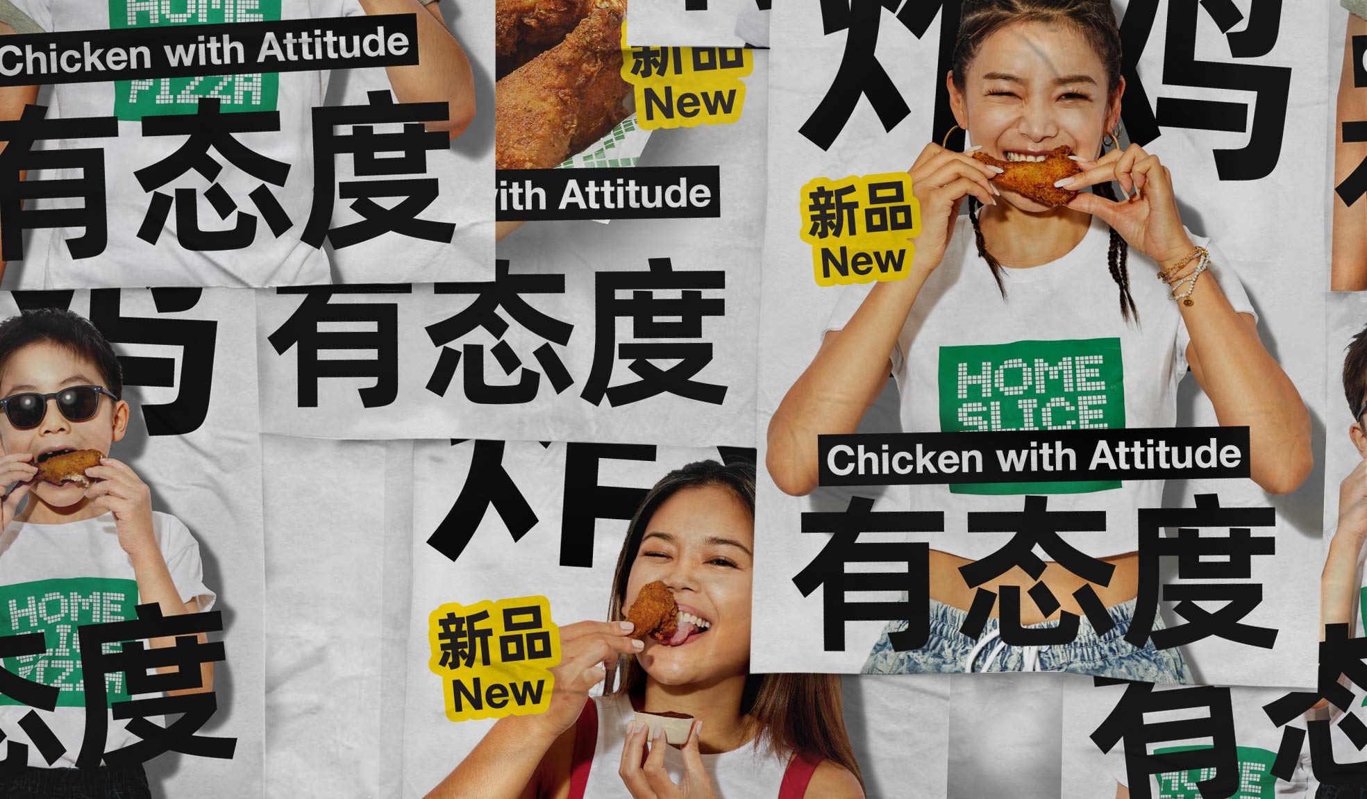
FRIED CHICKEN was the end game of a brand overhaul, upgrading HOMESLICE’s organically built brand assets into a system that could support any of their ambitions for the future. The company wanted a distinctive look that they could truly own, something that was straightforward, memorable and showed their personality (BOLD). From audit to strategy to workshops, we picked over every detail with the team, creating a super clean new set of brand tools that put on the stage from their unique pizza slices and attitude.
INTO CAMPAIGN. As the brand wanted to remain personable, having talent was a key direction for the launch campaign, making an international product relevant to the local market. There was a mini campaign to find our biggest fans, and in return for a huge amount of free pizza, they became the new face of the brand. A win win for everyone, and an unique set of powerful photography assets.
ALL IN ALL, from product launches to boxes to wechat posts, the final product is a 200 items brand tool kit that covers it all, and will enable them to create so much more in the future.
HOMESLICE, it’s been awesome working with you guys, we can’t wait to see more of it in 2023.
PACKAGING FOR A CROWDED CATEGORY
Launching their first localised, multi-product coffee series: from drips to bags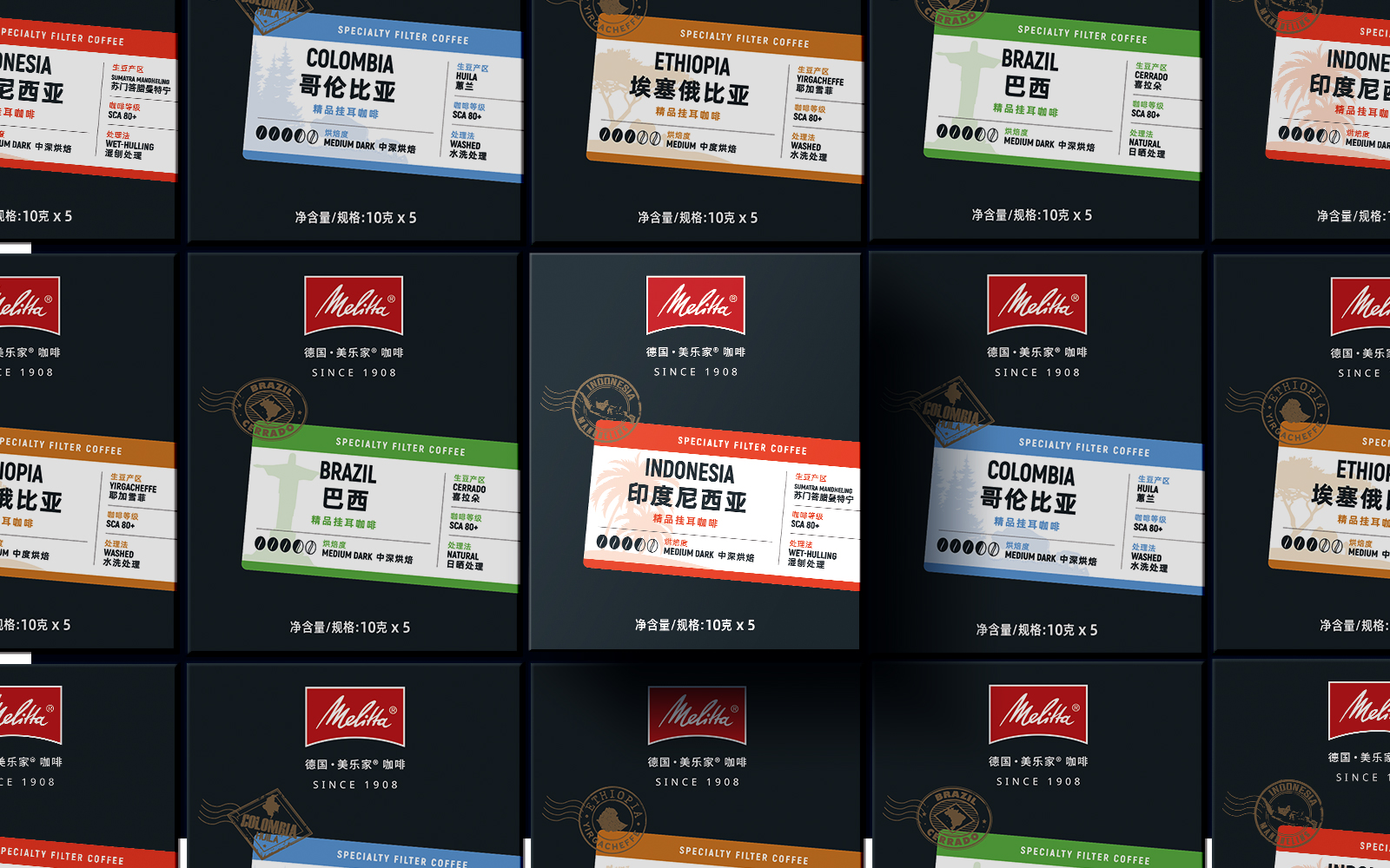
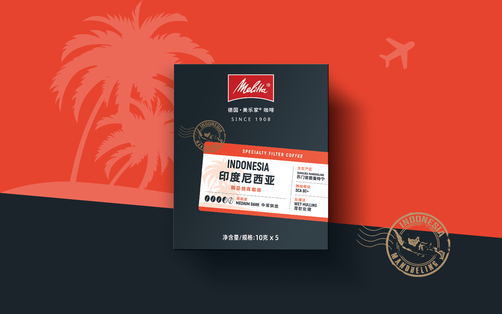
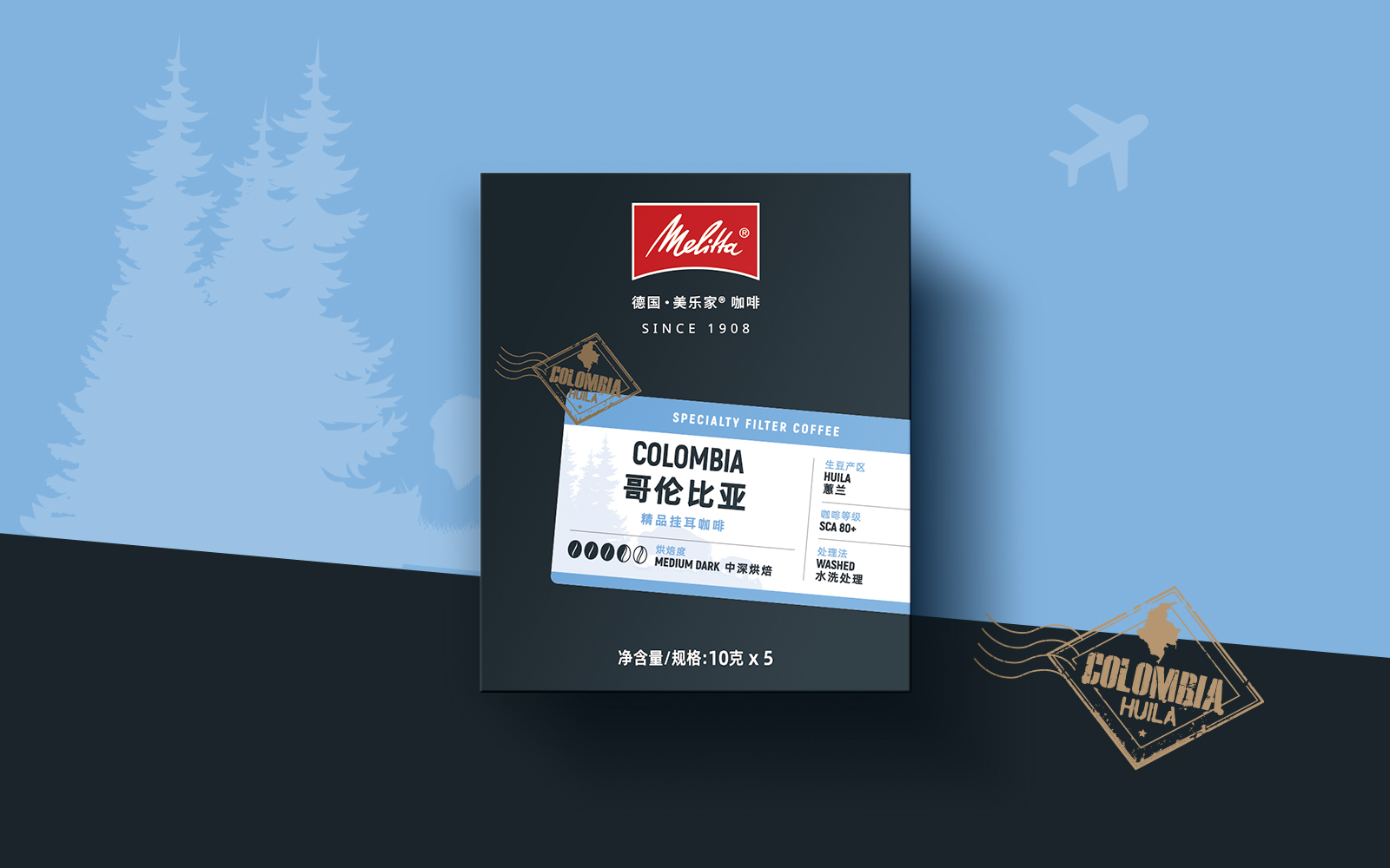
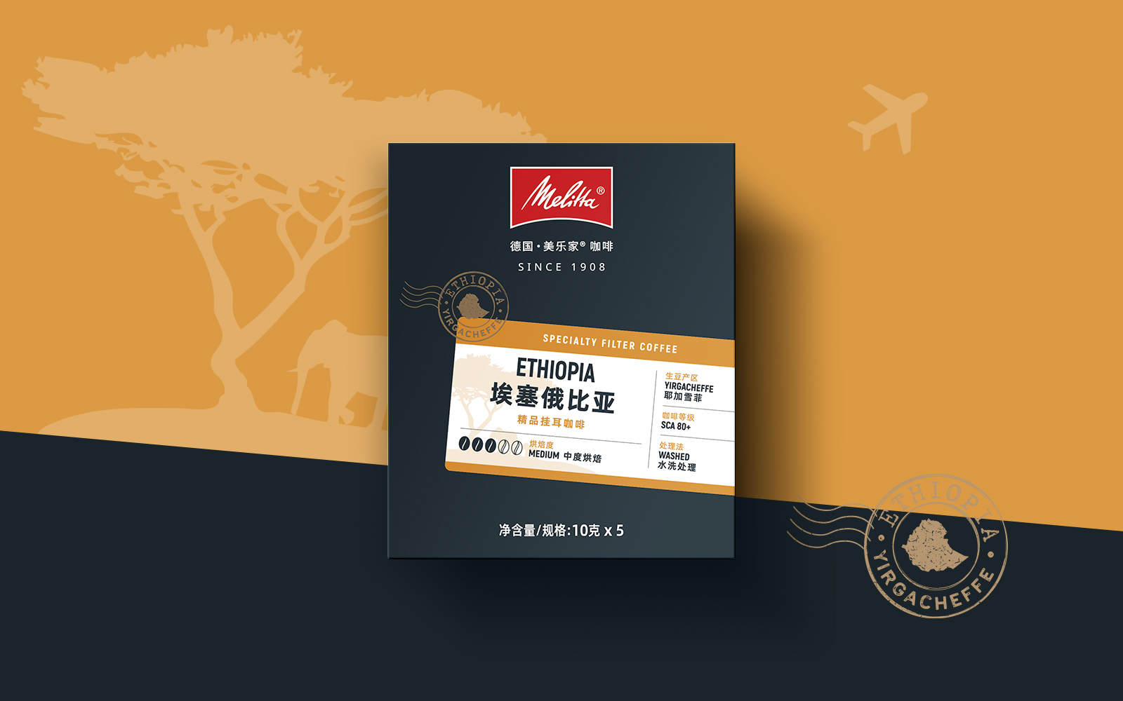
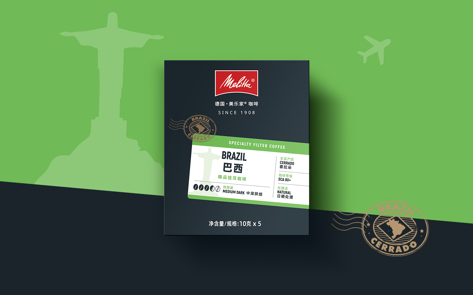
ORIGINALLY FROM GERMANY, Melitta has held a leading role in the coffee history worldwide, having invented the paper coffee filter over a century ago which democratised the consumption of coffee at home. Coming into China at a time when the market competition is fiercer than ever, how might they take the pole position of home consumer coffee products?
CHECK CHECK! We all like a good checklist, yet this packaging design has a lot of boxes to tick:
conveys the German heritage & DNA of the brand
echoes with the local market is premium, yet approachable
is flexible enough to work across different products, works well online and offline,
can be used to create secondary brand assets.
THEN THINK After a fair dose of strategizing, we created four distinctive concepts to try out to merciless consumers in focus group testing Luckily, there was a clear winner, so we could finalise all the packaging needed for the full range, right before the coffee came out of the roastery.
THE WINNER? The one that inspired customers looking for a moment out of their daily lives! Using the visual language of tickets, passports and postcards, the concept, presented in a clean design style on both the packaging and in supporting marketing – online and offline.
View the full design case study here
or If you’d like a box of these clever pour over coffee sachets, check out their store on Tmall.
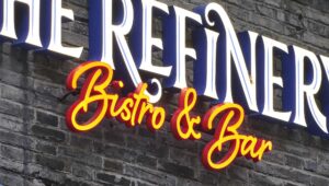
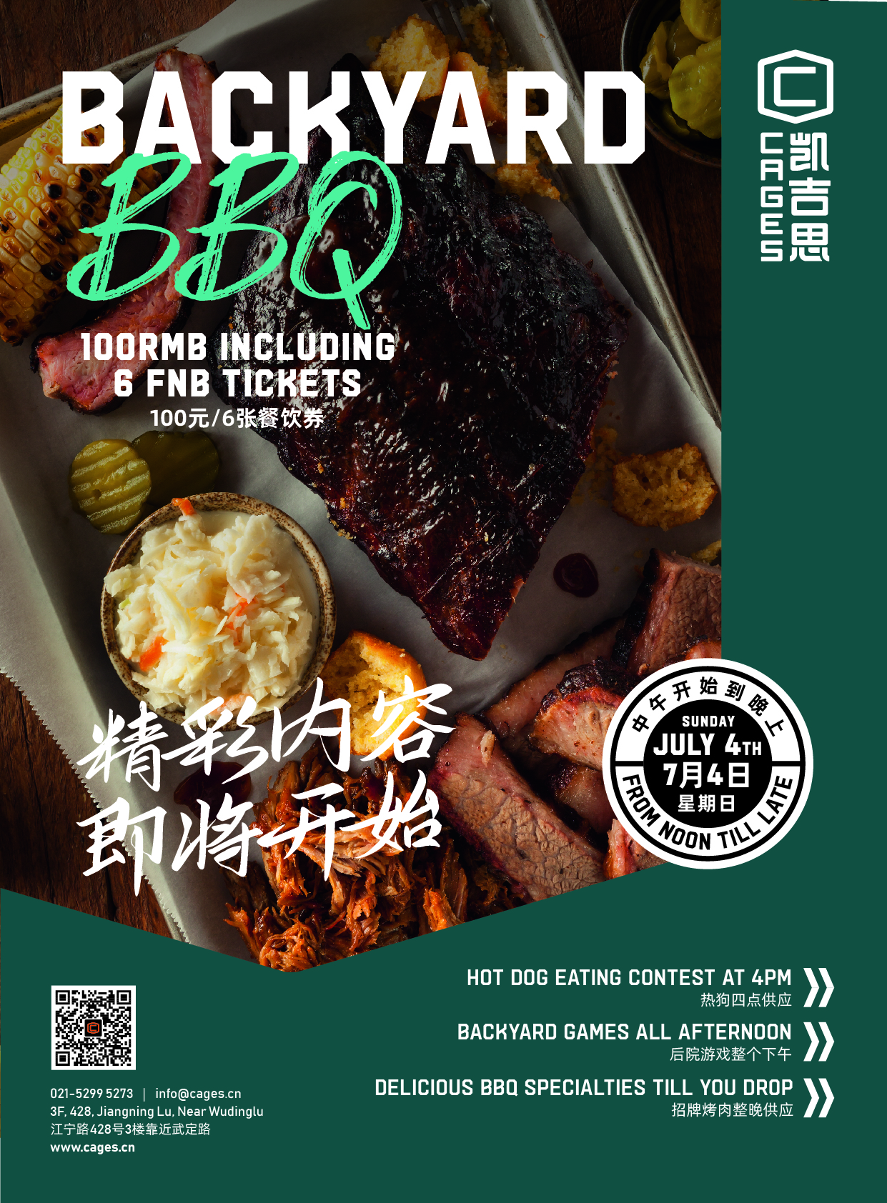
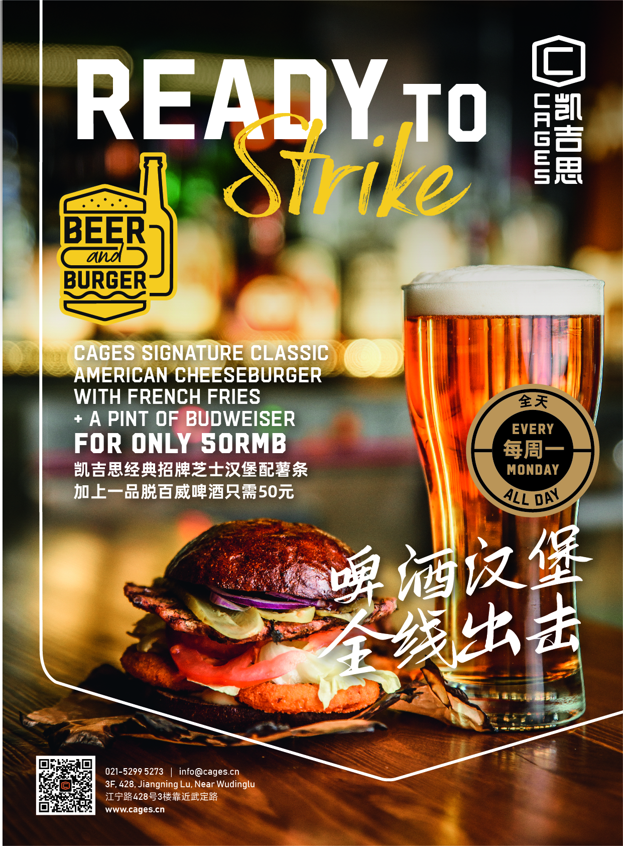
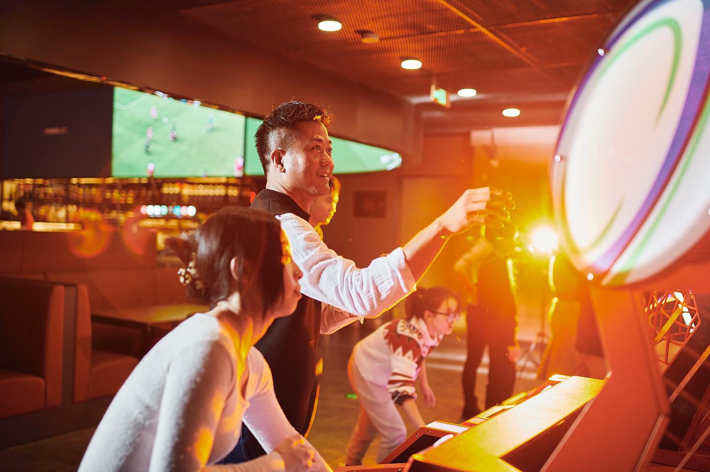
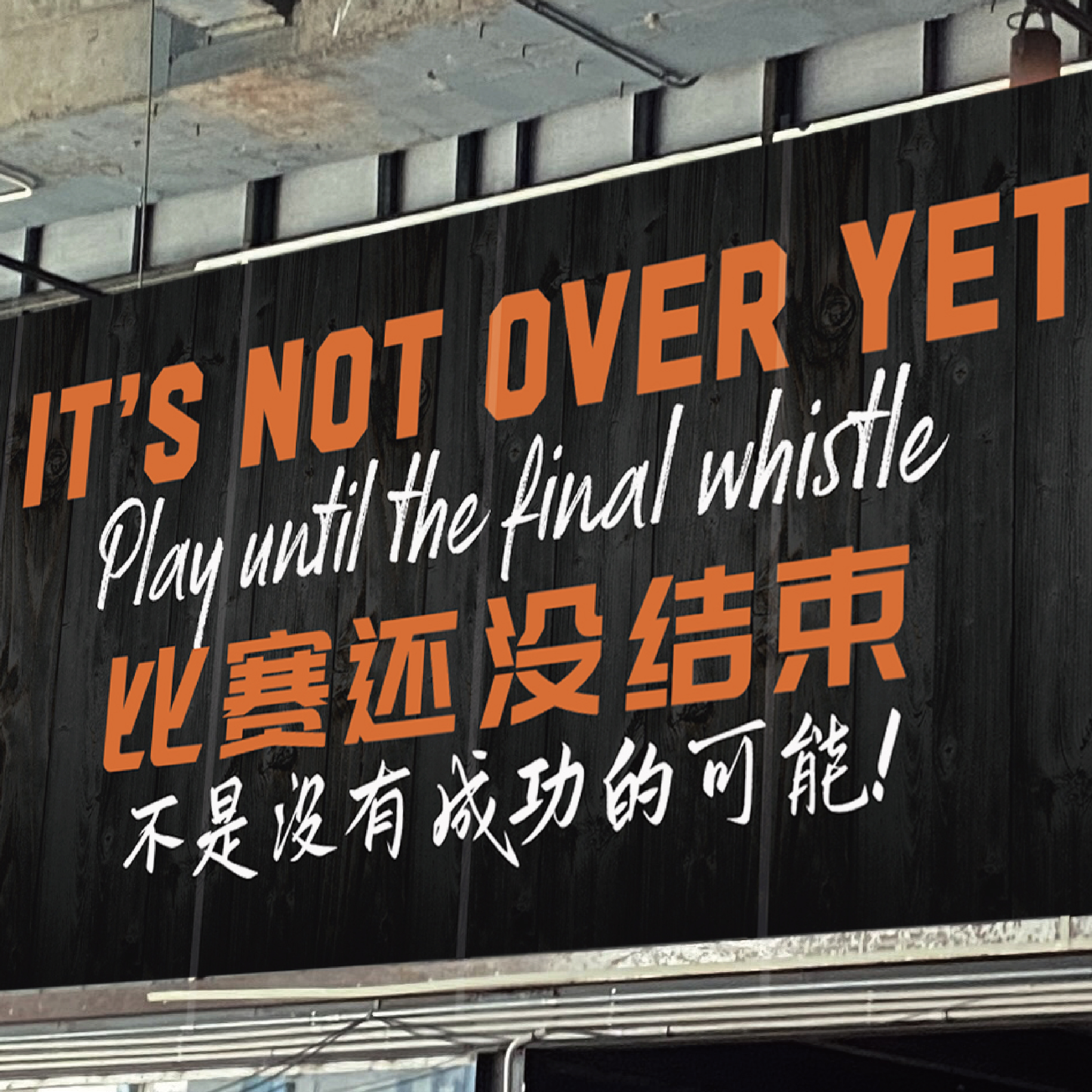
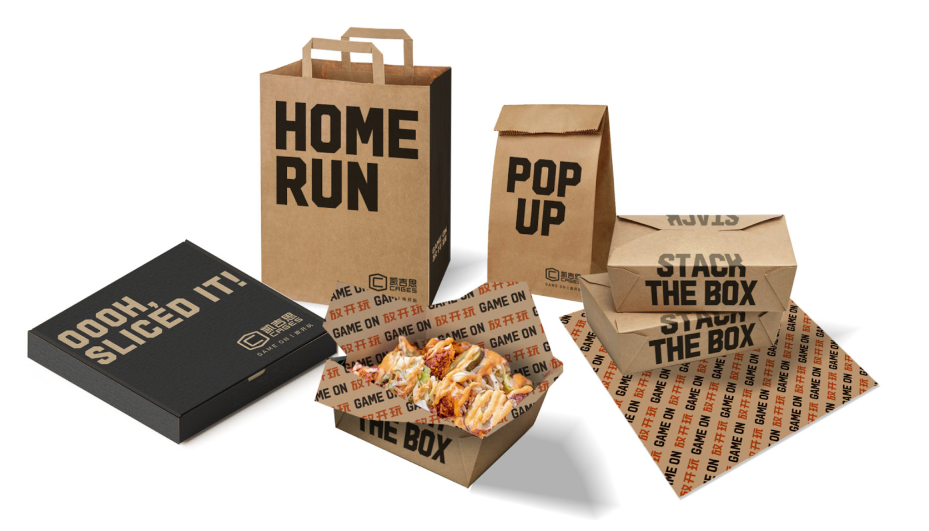
KNOCKING IT OUT OF THE STADIUM
Brand extension and creating a systematic approach to experience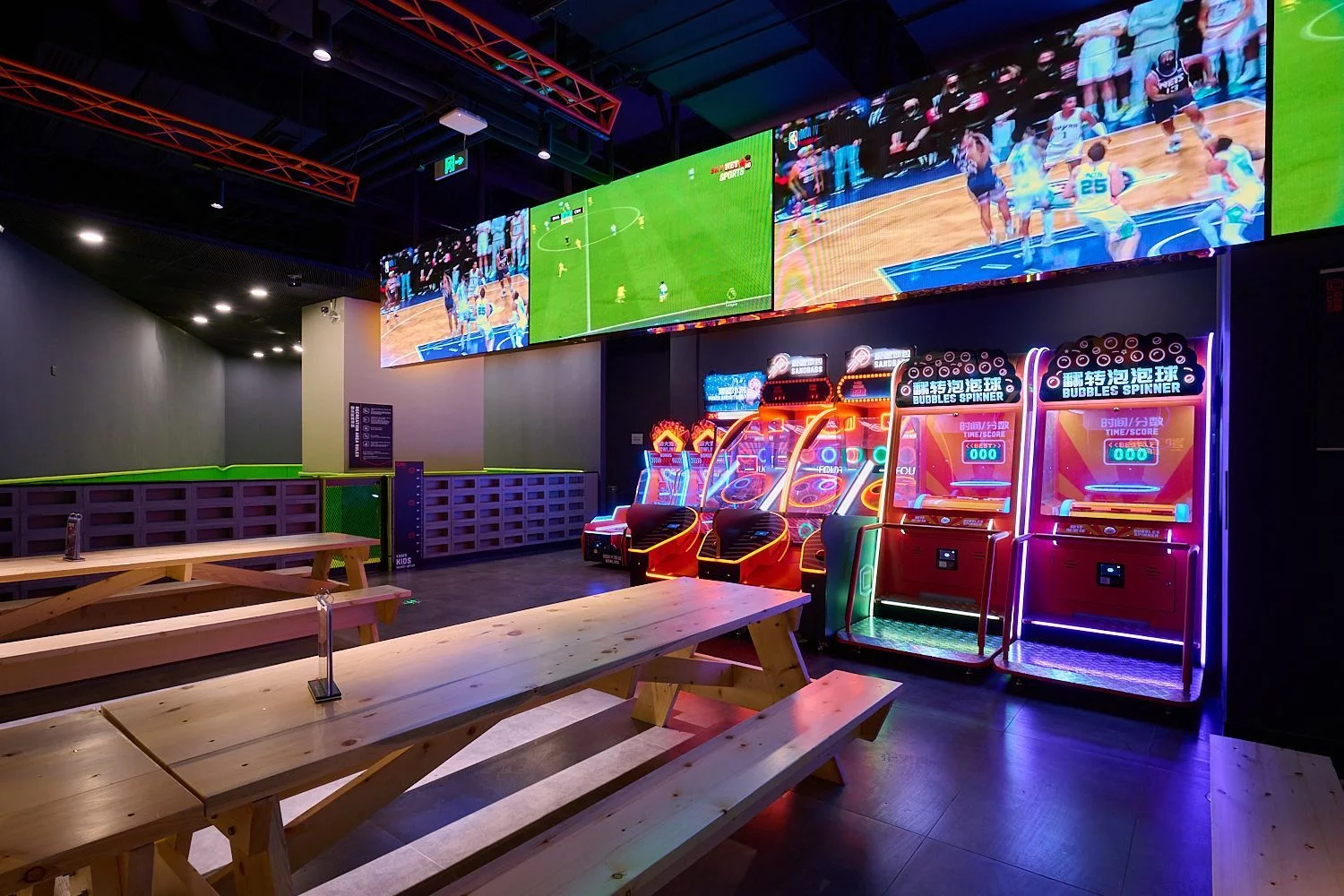
DEPLOY. The first half of the year saw Cages’ brand upgrade unroll across the old and new venues.
STRATEGIZE. After an in-depth brand audit, understanding the expectation of the local customers to an originally foreign concept and understanding the standpoint of the internal key stakeholders, we worked together to create a solid position to grow from.. Experience, outstanding food and drinks and a lot of play!
PUT THE WORK IN. Bringing it all into design, the new brand identity features an evolution of Cages previous mark, refining it further, but extending the brand into a large set of sports related secondary identifiers, bold layouts, playful copywriting based on sporting terms, outstanding wayfinding and a wide range of marketing templates that can be used by multiple teams and venues.
This extension of the brand language will also help the brand grow into whatever they need to be under this umbrella, enabling it to offer a broad range of experiences, as one recognizable brand.
PLAY. We also took on a challenge that few agencies get asked, designing game livery. Now if we’re asked, “Have you ever designed a case for a BUBBLES SPINKER game before?” The answer is YES!
CELEBRATE. Cheering on the superb team at Cages, who just don’t seem to be able to catch a break this year, lock down after lock down across their venues. Wishing for 2023 to be only GAME ON!
