Cages rebranding
It's time to game on!
是时候该放开玩了!
Project
Rebranding
Location
Shanghai, China
Revitalizing CAGES involved a dynamic reimagining of its agency brand identity. Our team, acting as a branding agency, focused on creating a logo variety that resonates with the brand’s energetic atmosphere. The introduction of logo neon elements and a comprehensive brand book example provided a vibrant and cohesive visual language for the venue.
Redefining the CAGES visual language and giving it a strong presence based on their unique personality.
Our role was to audit, workshop, define, then roll out the brand across every touch point, ready for a national franchise.
Our vision, an eclectic mix of Americana with inspiration from the world of sports and games. A visual language from leathers and wood to meat; black from iron and BBQ, to the neon glow of gamer tech, all tied together with CAGES orange.

Brand Strategy
Creative Direction
Design
Copywriting
Wayfinding
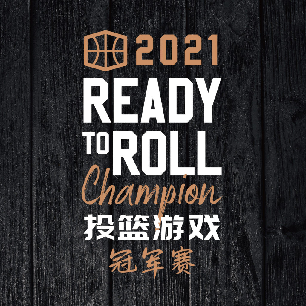
Game Livery Design!
Interior Space Review and Assessment
Our brand audit starts where you are. For CAGES, being an experiential concept, we had a detailed review of each area in the space individually and how it comes together, which enabled us to make a realistic plan of attack for the brand enhancement.
The new space uses language that communicates to customers there’s limitless ways to play at CAGES from special competitions, to watching games to parties and festivals. It also encourages friendly competition to get people to experience all the activities available.


before
after
ENHANCING
THE LOGO
The new CAGES logo has been adjusted to ensure balance and consistency between the English and Chinese typeface.
The Chinese characters have been thinned out and the edges of different letters have been rounded.
TYPOGRAPHY
We made typography the corner stone of the new visual identity system. By By defining six typefaces and a set of guidelines for using them, we gave Cages designers both flexibility and the tools to create a large amount of marketing with the same look and feel.


ICONOGRAPHY
Like sports and computer games, the use of icons feature heavily. We created a large number of icons that could be used to look like game UI, sponsors, prizes and of course way finding. These icons are great for decoration, highlighting events and games, or just to bring the brand to life on marketing.
WAYFINDING
CAGES venues are by their very nature large baffling places, wayfinding is critical to ensure visitors can find all the entertainment there is to offer. We created a flexible system combining, fun branded call to actions, enticing icons, and more standard way finding, to both upsell and increase the brand experience.

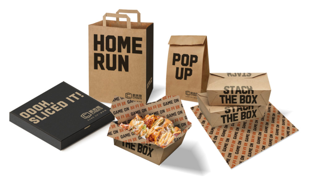
PACKAGING
For the packaging we wanted to have as much fun as possible. Using English language (to be less confusing) American sports commentary as fun pieces of typography that tie together with the food you might find in the packaging.
With all the ingredients ready the next challenge was
BRAND GUIDELINES
Fully developed brand guidelines to help build a brand across various touch points
Customers can now get the CAGES to experience through the packaging. Keeping in line with GAME ON, we extend it by leveraging language related to sports and different ways to play.
With guidelines in place, the next steps were to roll out the brand.
MARKETING TEMPLATES


GAME ON
With the brand relaunched, the interiors redesigned, new stores opening, it was time for the games themselves.
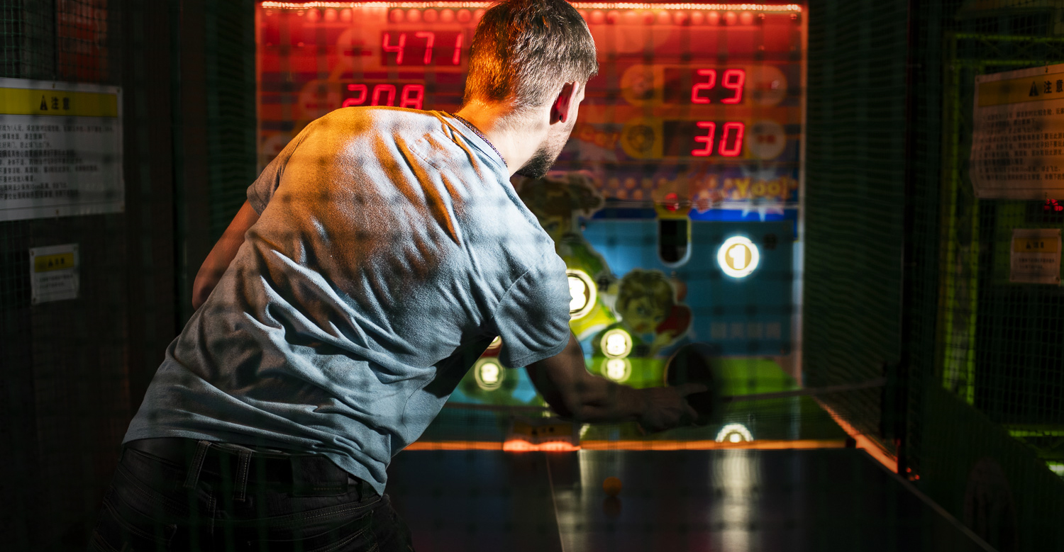
GAME MACHINE REDESIGN
Previous game machine designs were a mix of colours and styles, with incorrect instructions that also had grammar mistakes.
Updated game machines are now consistent with the overall brand identity and a clear game name on the front so you know what you’re playing! Game instructions also leverages language that encourages friendly competition.


At the end of the process, it all fits together.